Data Science Using Unsupervised Learning & Visualization of Astronomy Data

A simple visualization of a complicated data makes the science behind it seem obvious.
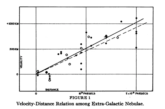
Above is the data plot by Sir Edwin Hubble in 1929 showing that farther the galaxy, faster it is moving away from us aka Redshift.
As we’ve mapped more areas of the known universe, we’ve discovered astounding structures on the largest scales. Visualizing this structure in 2 or 3 dimension maps give us intuitive grasp of the composition & properties of galaxies within the universe and the forces the creation of that structure.
There is huge public data available for scientific research, like the Spitzer S4G data — a survey of stellar structure within the galaxies.
Here is the snippet of spitzer dataset for some galaxies:
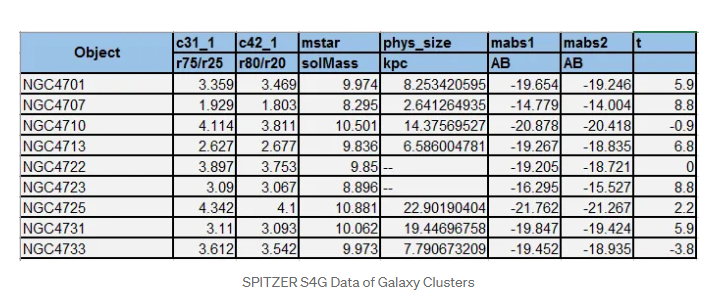
- mstar(solMass): log10(stellar mass)
- Using Mabs1 and Mabs2 in the calibration of Eskew et al. (2012)
- c31_1: r75/r25 concentration index at 3.6 microns
- c42_1: 5*log10(r80/r20) concentration index at 3.6 microns
- phys_size : In KPC (kilo parsecs). 1 parsec = 3.26 Light years
- mabs1 and mabs2: Absolute magnitude of light wavelength at 3.6 and 4.5 microns.
For more references please look up:

Sample description of these galaxies can be found on Wikipedia:

Doing a scattered matrix plot can give quick relationship between above parameters like physical size and stellar mass of galaxies.

Using unsupervised learning like PCA and t-SNE can further help in evaluating this data.
Here is the PCA plot of this data with 6 parameters.
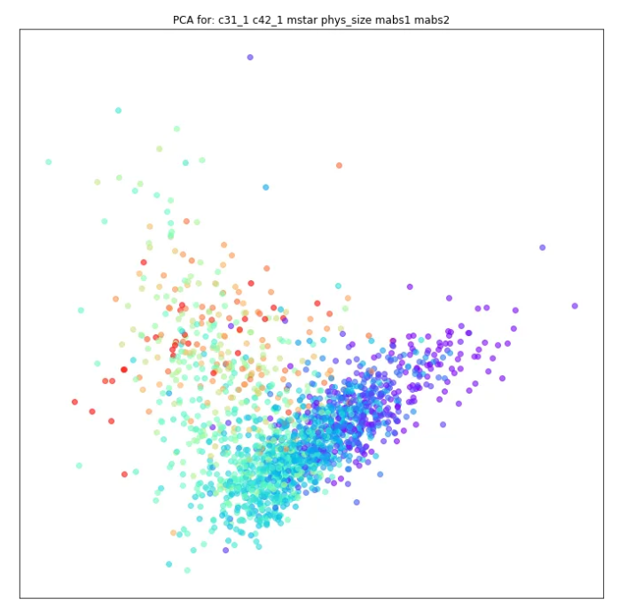
The results are bimodal. PCA clusters the galaxies based on the type Elliptical (Red) and Spiral (Blue)
Another approach would be to plot t-SNE unsupervised learning algorithm with various perplexity values. Different values tried here are 5,10,15,30,40 & 50.
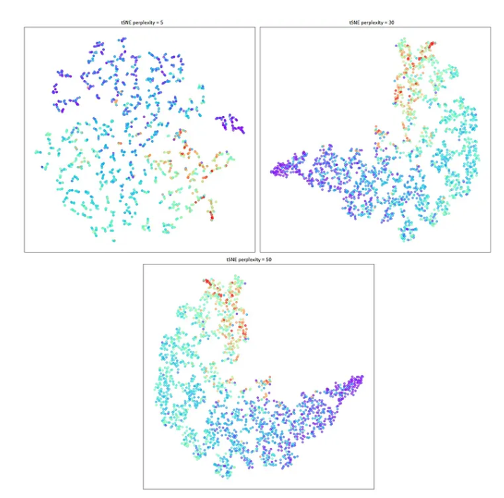
These plottings coraborate with the PCA analysis. We can zoom in further to select a pocket within this data. Selecting a part of the data for further analysis.
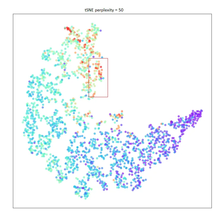
Plotting mstar & phys_size of this selective data of 30 galaxies, against their morphological type code “t” shows:
Reference: Galaxy Morphological Classification
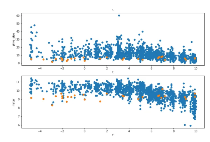
Conclusion shows that galaxies that we identified in the pocket of 30 are highly concentrated and of low stellar mass.
On April 25th this year, GAIA published its DR2 archive. I was going through this archive and stumbled upon this video.
Some quick plotting based on the above learning gave below visualizations
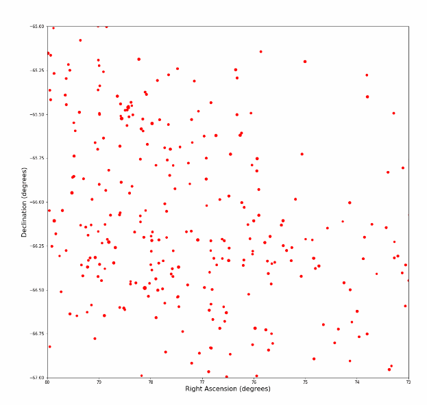
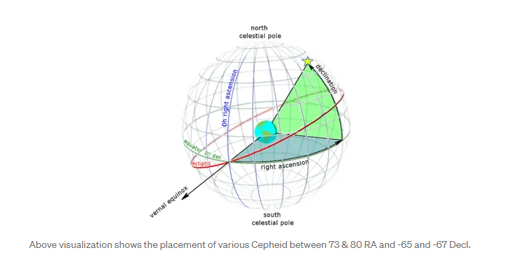
Visualizing Cepheid variables based on the limited arc data. Cepheid variables are candlesticks to gauge distances in space.
Since luminosity of each type of Cepheid is constant it is easier to extrapolate their distances from earth. Right Ascension and Declination are placement co-ordinates.
Right Ascension is the angular distance of a particular point measured eastward along the celestial equator from the Sun March equinox. Declination is the angular distance of a point north or south of the celestial equator.
Using Bokeh plot in python to plot GAIA exoplanet data with radius and mass compared to earth.

Source: https://iapp.org/news/a/the-privacy-pros-guide-to-explainability-in-machine-learning/
There are many other parameters like luminosity, temperature etc which can be visualized from this data. In my next article, I am planning to pay tribute to KEPLER by creating some of the visualizations and inferences from that data and to welcome TESS in 2019.
A more consistent and deeper initiative can create a boom in collaboration between astronomers, statisticians, data scientists and information & computer professionals and there by helping to accelerate our understanding of the SPACE around us.
#datascience #astronomy #GAIA
Ask about pricing
Author

Dhaval Mandalia
Dhaval Mandalia is co-founder of Arocom with 20+ years of experience. He works on various Artificial Intelligence projects in various domains. He enjoys data science, machine learning, data engineering, management and training. He writes blogs about data and management strategies and creates vlogs on various health initiatives. He has been a contributing member on various AI communities. Follow him on